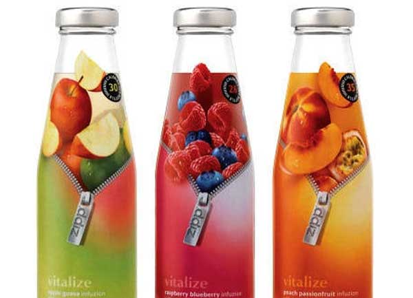
It is believed that color psychology is among the key points to be considered while designing a label. The colors can subtly influence the consumer’s emotions and send them some messages. If the business strives to have a good position is visual market as well, the color psychology should be applied correctly.
Generally, there are three main color psychology insights to be considered for a label’s design.
Color experts believe that colors have the ability to manifest all kinds of emotions for consumers. Moreover, they should also coincide with the actual aim of the brand. The following colors are supposed to be attractive taking into account the emotions they generate:

Green – relaxation, feeling of happiness, as a symbol of nature, green also has an effect to reduce the blood pressure.
White – cleanness, relaxation; it is also believed to bring about a feeling of security.
Black – wisdom and sense of stability; it is classy and emits refinement.
Blue – symbolizes creativity and feeling of happiness; it exudes trust and reliability.
Orange – is connected to adventure, vitality and even hunger. It has also something to do with self-confidence.
On the other hand, there are colors that have the opposite effect on the consumer and may stimulate negative emotions making the customer avoid the product rather than buy it. Producers should be cautious while using the following colors in the labels:
Pink – causes sense of calmness and lethargy.
Red – manifests feelings of failure and danger. Depending on the combination with other colors, it can also imply sense of strength and power.
Bright yellow – triggers feeling of danger and irritation.
Brown – can evoke association of depression, sometimes relaxation and apathy.
The initial associations of the colors do not imply that they should totally be avoided in the labels. The point is for the colors to coincide with the brand itself, its name and image. The ideal will be the combination of two colors from each section.
