11. Saperavi Malbec -7 Coline
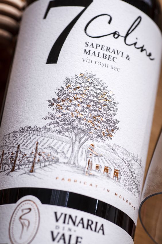
What a great combination of impressive highlights and fonts! Don’t be afraid to experiment and play with them. At the end, that is what makes your label outstanding.
12. Ancienne – Nova Scotia
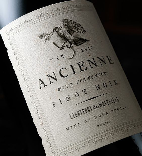
Use decoratively cut corners! It gives the impression of an old paper so which means that your label will look like that of a classic and an old heritage wine. The right choice of the paper color will create a better impression of this.
13. Alvi’s drift
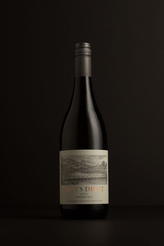
Make sure you use illustrations of the vineyard or coat of arms. It is going to make your label look like it has an old story. Such illustrations are about inseparable part of any classic wine label.
14. Золото Крыма – Бахчисарай
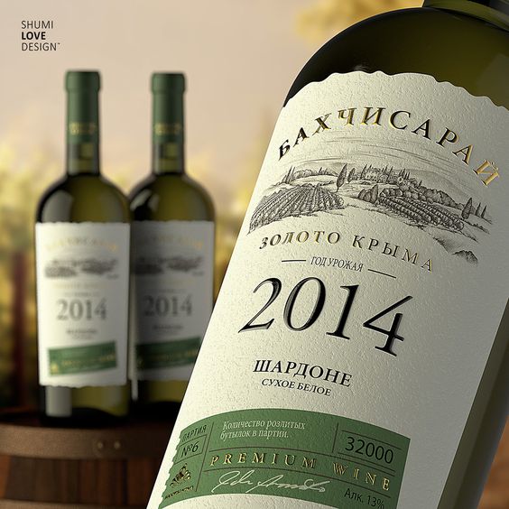
In case of choosing a white, pale or black background (which, as it has already been mentioned above, is very typical of classic labels), you can have a second color option which shall be a mature one to make it look good with some golden foil prints or with another classic design.
15. Pacific Bay
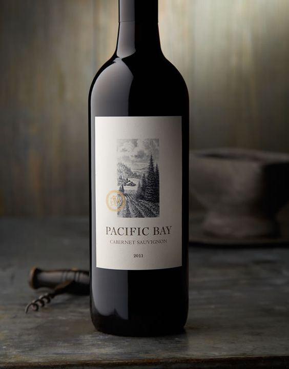
Don’t be afraid of a lot of white space. It usually looks better and more professional. What matters in this case is the shade of the background.
